Logo Design | Photo Treatments | Brand Colors
I completed this project during my graphic design internship at Clean Advertising and Design in Raleigh, NC, during the summer of 2022. The client, The North Carolina Theatre (NCT), came to Clean looking to redefine their brand and appeal to a more diverse and younger audience.
I worked alongside lead designers under the direction of Glen Fellman, Creative Director, on logo designs for the rebrand. After several rounds of revisions, my design along with a concept for the look and feel of the brand, was among the final two choices.
The tagline "Reimagined with every act" was developed by copywriter Joel Stiling.
Goals
Design a logo that would modernize the brand and make it more relevant to a younger, more diverse audience.
Present "inspiring, energetic, and off-beat" visuals to accompany the logo design.
Brand Vision
"The Vision of North Carolina Theatre is to preserve the unique American art form of musical theatre, to provide broad access to the arts and to entertain and engage diverse audiences.”
- nctheatre.com
Design Choices
The logomark draws inspiration from the traditional shape of a theatre stage, with the rounded edge of frontstage, the notches to represent the off-stage wings, and the rectangular body of backstage.
The condensed, sans-serif typeface brings a modern flare and energy to the logo that the previous logo lacked. The new shape of the simplified logo makes it more effective in a wider range of applications.
Color
The client felt strongly about maintaining red as the main brand color because other colors would be too large of a departure from the original brand.
I’ve chosen a darker, more welcoming tone of red and paired it with bright colors that allow for the off-beat style NCT was seeking while maintaining an important part of the brand’s history.
Logo Usage
Duo-tone imagery is utilized as a departure from traditional photo treatments, communicating NCT’s artistic approach and funky personality. The bold, colorful designs appeals to a younger audience, and the representation of diverse performers ties back to the brand’s vision.
In the proposed visuals, this stage shape is used as a framing device, highlighting the versatility of performances that happen on stage. The performers become a part of the logo, communicating that they are the backbone of NCT.
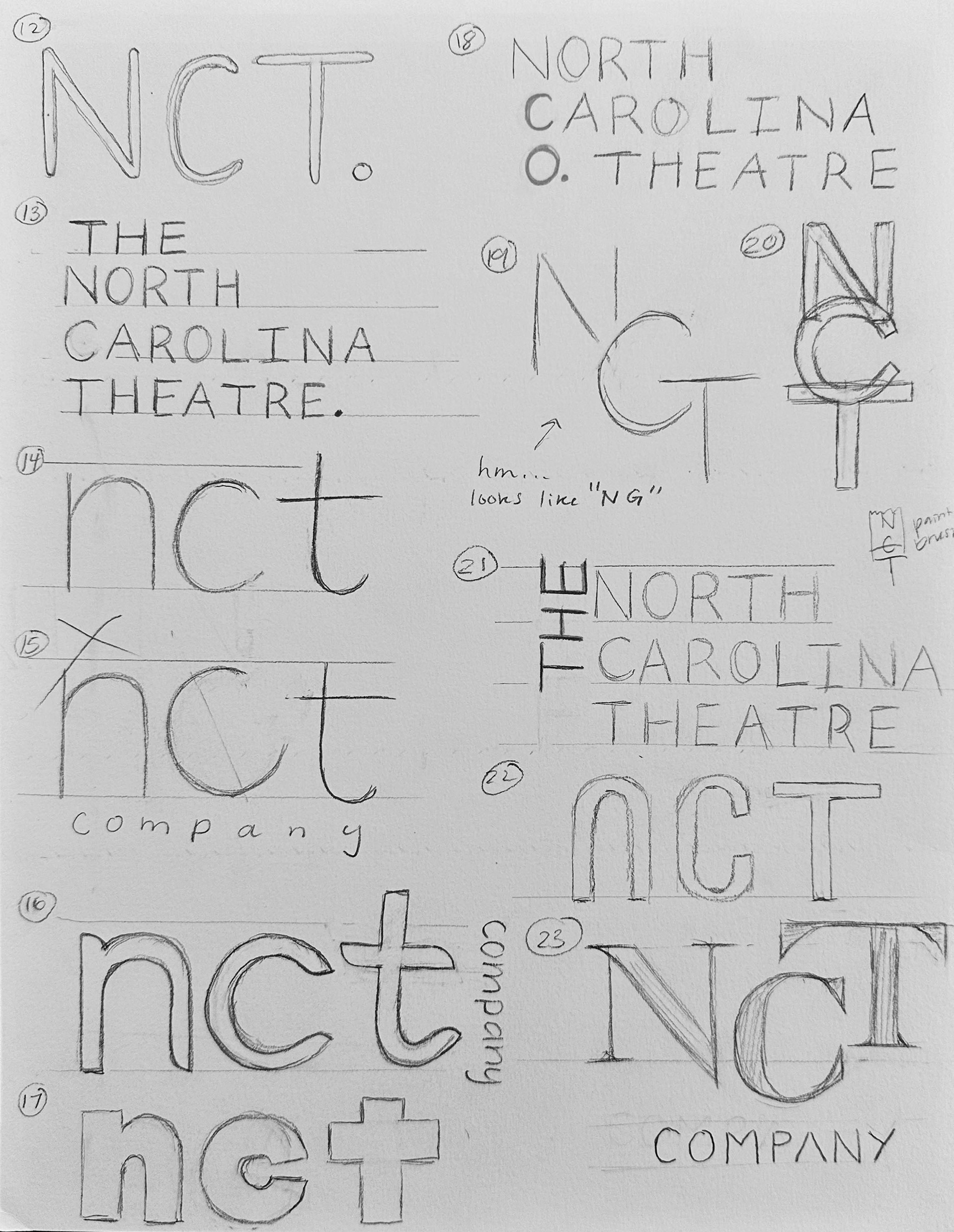
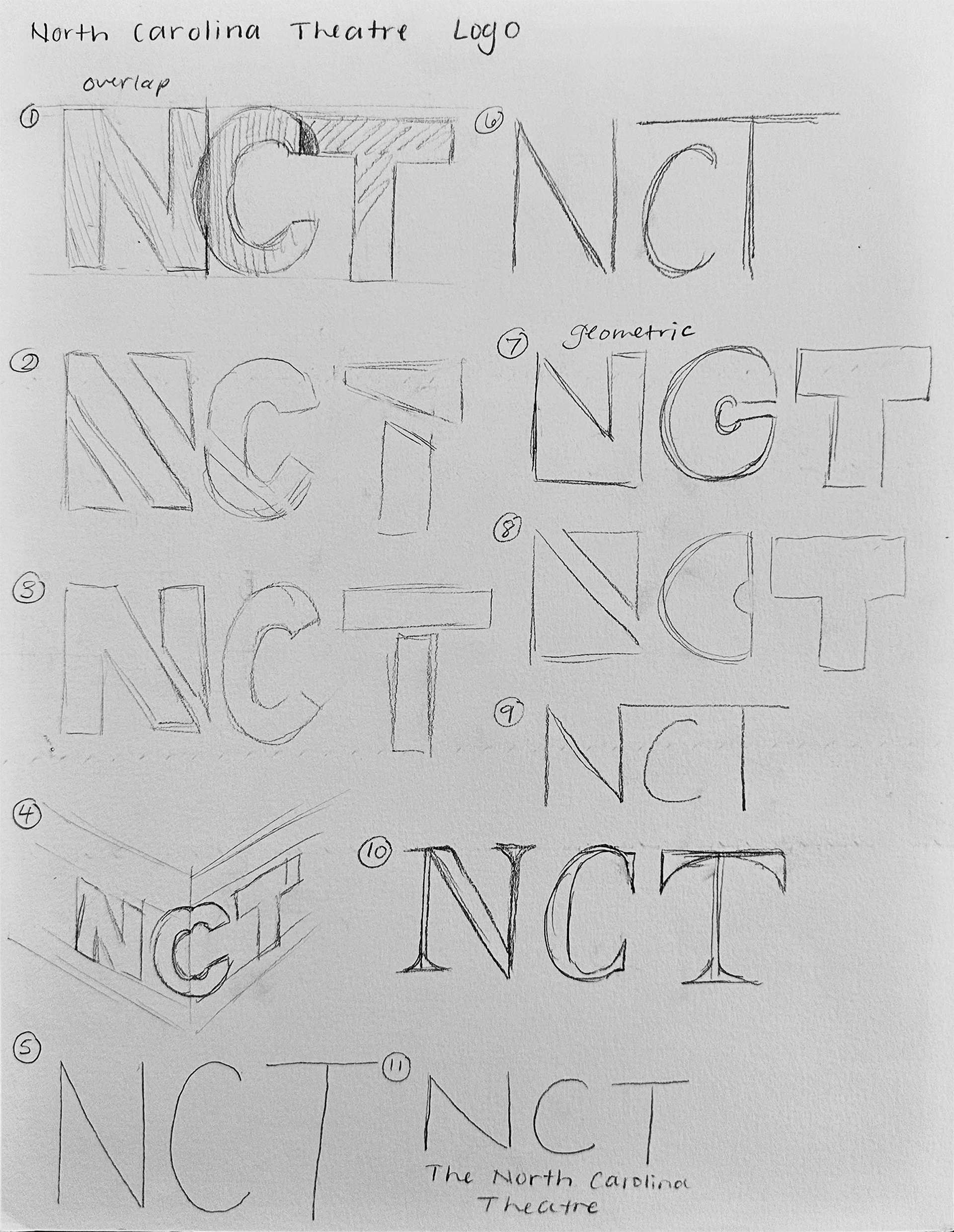
Process
