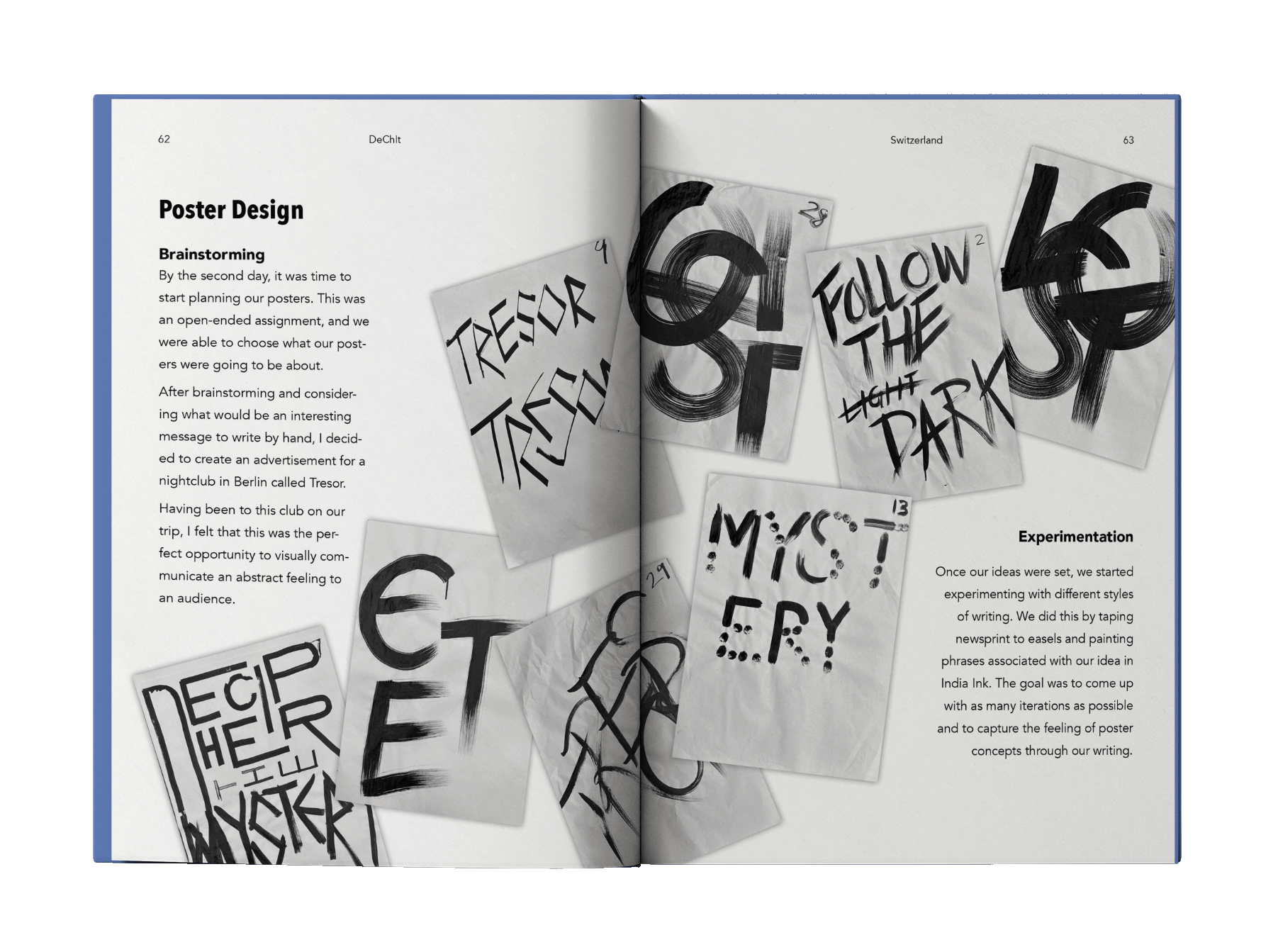
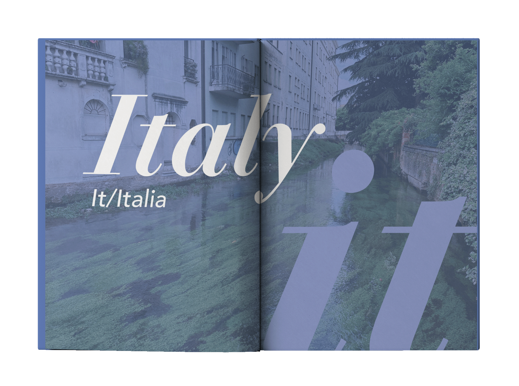
Book Cover Design | Typography | Page Layouts
During the summer of 2023, I was one of ten graphic design students from East Carolina University who ventured to Europe for a study abroad program: “Typography: Then and Now,” also known as “Dechit.”
We traveled through Germany (de), Switzerland (ch), and Italy (it) to learn about the history of typography and the role it plays in contemporary society.
Goal
When we returned home from the trip, each of us was tasked with designing a book covering what we had learned and seen along the way. In my book, I focused on using typography to capture the essence of each country.
Design Choices
The fonts used on the cover each have a special connection to the country they represent.
De/Germany: Black letter text was frequently used by Gutenberg, the inventor of the Western printing press.
Ch/Switzerland: Designed in 1957 by Max Miedinger and Eduard Hoffmann, Switzerland is the birthplace of the Helvetica typeface.
It/Italy: The Bodoni typeface represents the elegance of Italy. It was designed by Giambattista Bodoni, an Italian type designer.
